Overview
As organizations grow and evolve, their design systems don’t always follow suit. CVS was no exception and at a point in time, the kit they had was good enough to get the job done. Inevitably, if there is no plan in place, that kit soon becomes obsolete due to lack of process for spearheading, owning, building, training, updating, policing, evolving, etc. Before you know it, everyone has their own unique version of the kit that sat on their hard drive and started to effect brand consistency, redundancies, design debt and numerous other issues. CVS knew they were at the crossroads of migrating from a UI kit to a full-fledged corporate design system. They say timing is everything…well, it sure was in this case. CVS was looking for someone to lead the project and our paths crossed at the right time.
Discovery & Audit
Discovery proved to be a very robust phase for this project. It started with a series of meetings with both internal and external people and teams from across the organization. All meetings and workshops went a long way at helping identify the Current Situation and distilling down Common Challenges. Some meetings were used to jointly create a Design System Framework. I found this to be an invaluable exercise as it helped tease out discrepancies in peoples familiarity with design systems. I followed up with subset groups and had them participate in a FigJam Strategy Blueprint Exercise. This exercise helped establish the overall strategy that moved us forward.
This was the first time team members from all the disciplines were part of a collaborative process like this. It positively seeded the project by creating an inclusive, transparent and participatory environment.
In parallel, I created sub teams to lead working sessions with other trains and divisions to help initiate a comprehensive audit of all existing libraries to help evaluate redundancies, component structure, gap needs. All in, this phase produced numerous artifacts and deliverables to help us move into the next phase.


Common Challenges
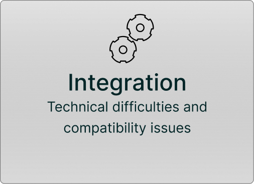
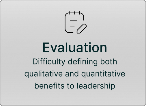
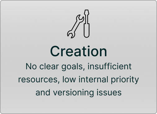
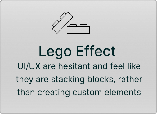
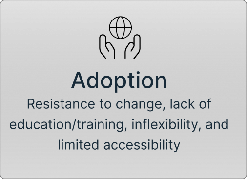
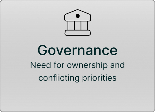
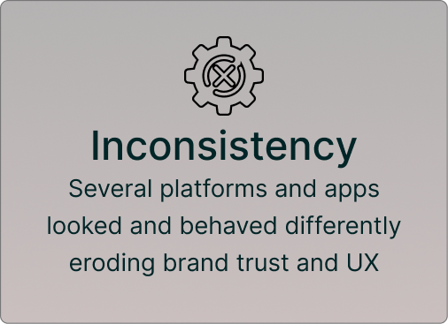
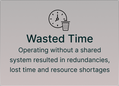
After several busy weeks of both internal and external interviews and digging deeper into the history of CVS’ experience with design systems, I was able to summarize past challenges the design systems teams’ encountered.
The Challenge
A few months after starting at CVS, I was asked to lead our Design System Initiative, a major undertaking that higher management backed with fresh budget and staffing. Leadership believed that my background in brand guides, instructional design, and online learning would provide a fresh perspective for this complex challenge. Before moving forward, I had to go backward. I launched an audit of past solutions and failures while interviewing cross-functional departments to gauge their pain points and expectations for adoption. These interviews highlighted the classic friction points of enterprise systems: managing the design-to-code handoff without building technical debt, and overcoming cultural resistance from teams worried that standardization would stifle product innovation. Because of this history, I knew our path forward required strict, best-practice frameworks for governance and documentation. This ensures that our upcoming solutions aren’t just built, but are actively adopted and scalable across the entire company.

ComponentLibrary vsDesign System A CVS PSA
- A collection of pretty UI elements
- Documentation that lives in isolation
- Something designers love and developers tolerate
- A nice to have that gets abandoned under pressure
- Set of tools that solve real development problems
- Governance that s consistent without being annoying
- Documentation that developers want to use
- An essential part of the development workflow
StrategyBlueprintFigJamSession
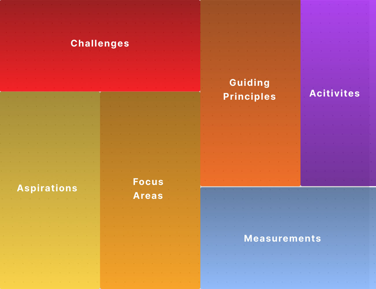
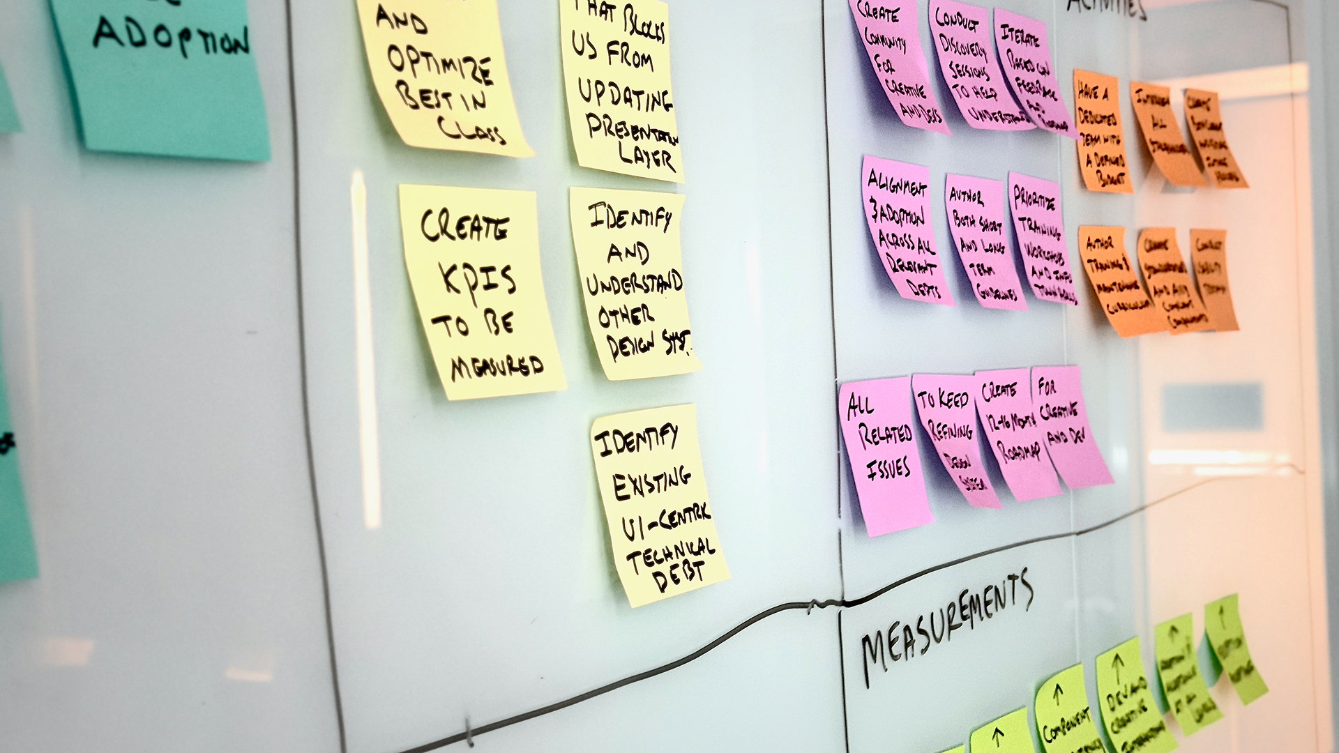
FigJam Strategy Blueprint Session One of the first FigJam sessions we had was to collaboratively complete the Blueprint. The information gleaned will directly inform the roadmap, workflow, component creation process and more.
Current Situation
After completing numerous interviews, audits and workshops, the Strategy Blueprint session was the last exercise for this phase. It helped us to distill down the current situation and inform our next set of artifacts. While this wasn’t a total surprise, it was invaluable for getting sign-off, support and direction from corporate.
Solution
We were past the point of simply updating the design kit and now had a clear understanding of why previous attempts had failed. This time, we set out to build a scalable design system supported by process, documentation and governance needed to sustain it. Establishing a clear vision, defined process, and measurable deliverables was instrumental in securing leadership buy-in and differentiating this initiative from past efforts.
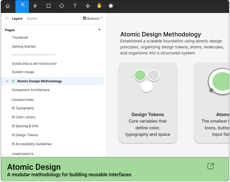
We developed a roadmap informed by audits, stakeholder interviews, and cross-functional workshops. Using Atomic Design Principles, we created a centralized Figma library of reusable components, design tokens, and accessibility standards to support CVS’ digital products. Equally important was bridging the gap between design and development through shared guidelines, defined ownership, and transparent processes for ongoing contributions and updates. By fostering a sense of shared ownership, we aimed to create a trusted resource that teams would actively adopt, maintain, and evolve.
Pre-Buildout Housekeeping
Following the first phase, I generated several vital artifacts to keep stakeholders aligned and maintain project momentum. First, I developed a Design System Roadmap. This tool helped senior management visualize resource prioritization and set clear timeline expectations, which proved invaluable for securing ongoing buy-in and sign-offs.
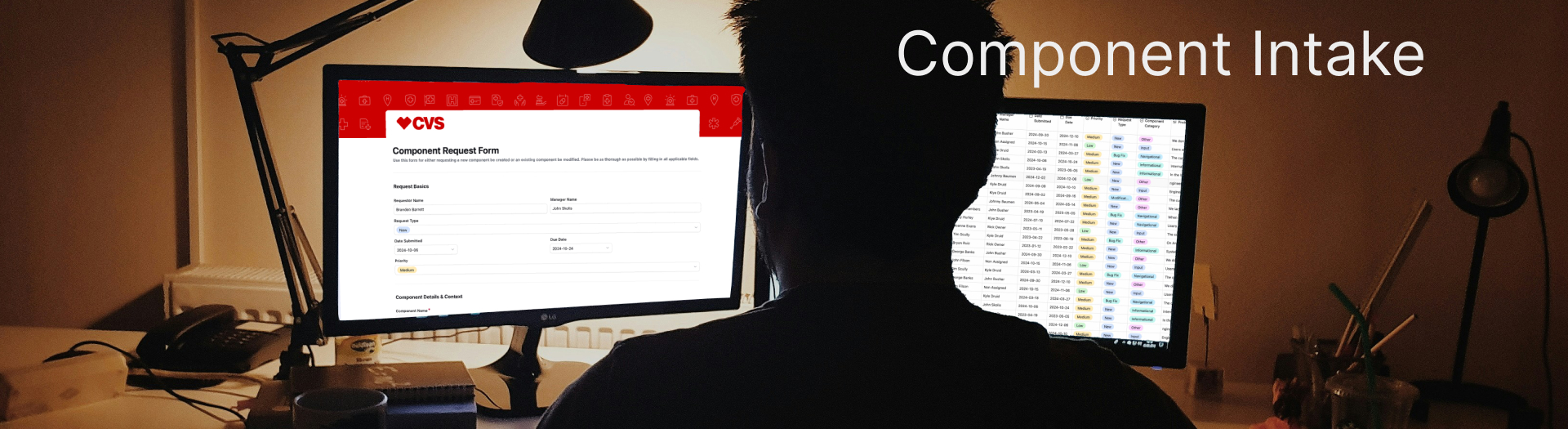
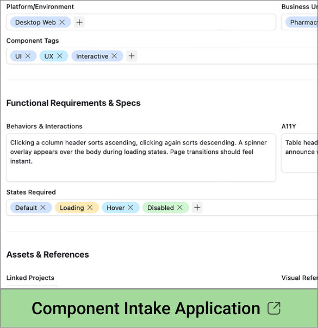
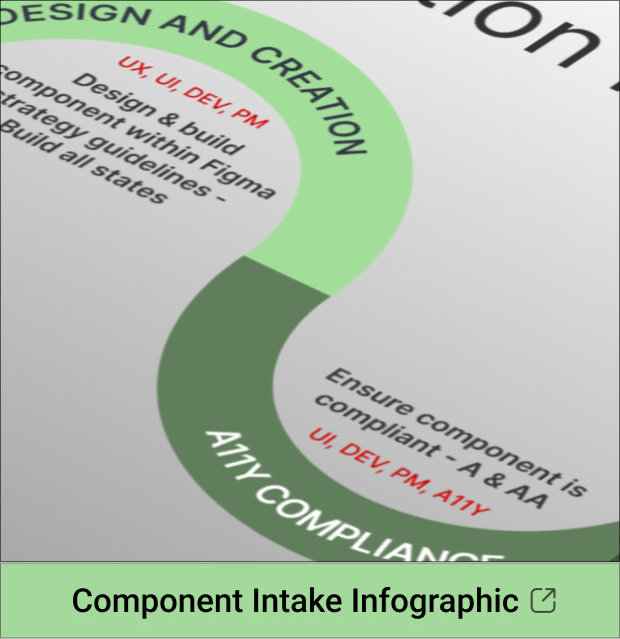
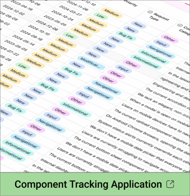
Because active projects still required new or modified elements during this pre-build period, I introduced a Component Creation Infographic and an Intake/Tracking Form via Airtable. This structured process successfully managed ongoing asset requests while educating teams on the upcoming workflow.
Concurrently, I initiated foundational housekeeping within Figma to prepare our workspace for the build phase:
-
Project Metadata: Added clear descriptions across all active projects
-
Standardized Naming: Applied a consistent naming convention to all components
-
Visual Organization: Ensured uniform project thumbnails for better navigation
-
Future-Proofing: Integrated Figma’s design tokens (variables) to streamline scalability
 Design Systems Roadmap
JUNE
Step 1
Establish Goals
→ Establish a systematic way to be more efficient and enable
→ Create One Source of Truth with the Design System
→ Enhance collaborative process between designers, developers and PMs
→ Ensure our interim process for creating and tracking components is in place
→ Create a collaborative ownership spirit throughout

System Buildout
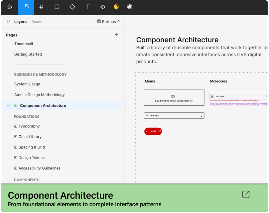
With the research and planning phases complete, we moved into building a scalable design system that could support the diverse needs of CVS’s digital products. Using Atomic Design Principles, we established a Structured Component Architecture, beginning with Foundational Elements such as typography, color, spacing, and iconography. From there, we developed reusable components, progressing from basic atoms to more complex molecules and organisms. Each component was designed with consistency, accessibility, and flexibility in mind, allowing teams to create cohesive experiences without sacrificing product-specific requirements.
Working closely with designers and developers, we established shared standards for component behavior, interaction states, responsive layouts, and design tokens. Figma served as our centralized design library, providing a consistent framework for component creation and reuse.
This approach helped bridge the gap between design and development, reduce redundant work, and establish a foundation capable of evolving alongside the organization’s needs.
Key areas of the buildout included:
-
System Architecture: Organized foundational elements into reusable atoms, molecules, and organisms
-
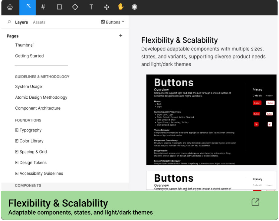
Flexibility & Scalability: Developed adaptable components to support varying product needs and interface requirements
-
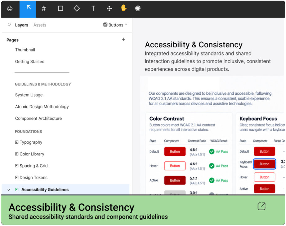
Accessibility & Consistency: Established shared standards for interaction states, responsive layouts, and accessible experiences
-
Design & Development Alignment: Centralized components and design tokens in Figma to streamline collaboration, reduce redundant work, and support long-term scalability
A11YPOURPrinciplesA CVS PSA
- Perceivable | Content must be accessible via different senses
- Operable | Interfaces must work with all input devices
- Understood | Navigation & interactions must be clear and predictable
- Robust | Experiences must work reliably with assistive technologies

My Role
My responsibilities spanned both strategic leadership and tactical execution, from defining the vision and roadmap to shaping the components, processes, and deliverables that brought the system to life. As the initiative lead, I coordinated designers, developers, and cross-functional stakeholders to ensure alignment between business objectives, technical requirements, and user experience goals. My involvement extended across the entire initiative, from auditing existing resources and facilitating discovery workshops to establishing the system architecture, component standards, documentation strategy, and governance model. While much of my role focused on leadership, planning, and decision-making, I remained hands-on, contributing to Figma components, design explorations, and documentation whenever it made sense. My end goal was to provide direction while staying close enough to the work to help turn that vision into reality.
Handoff & Documentation
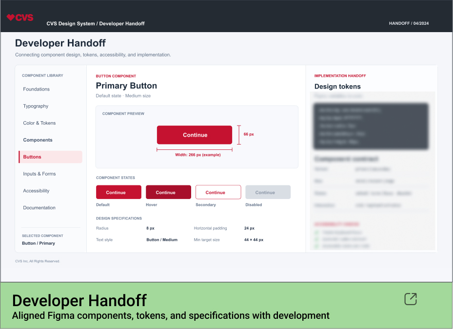
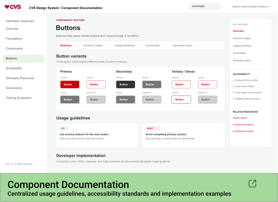
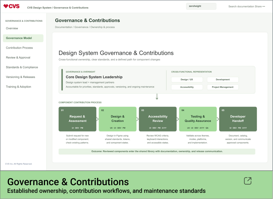
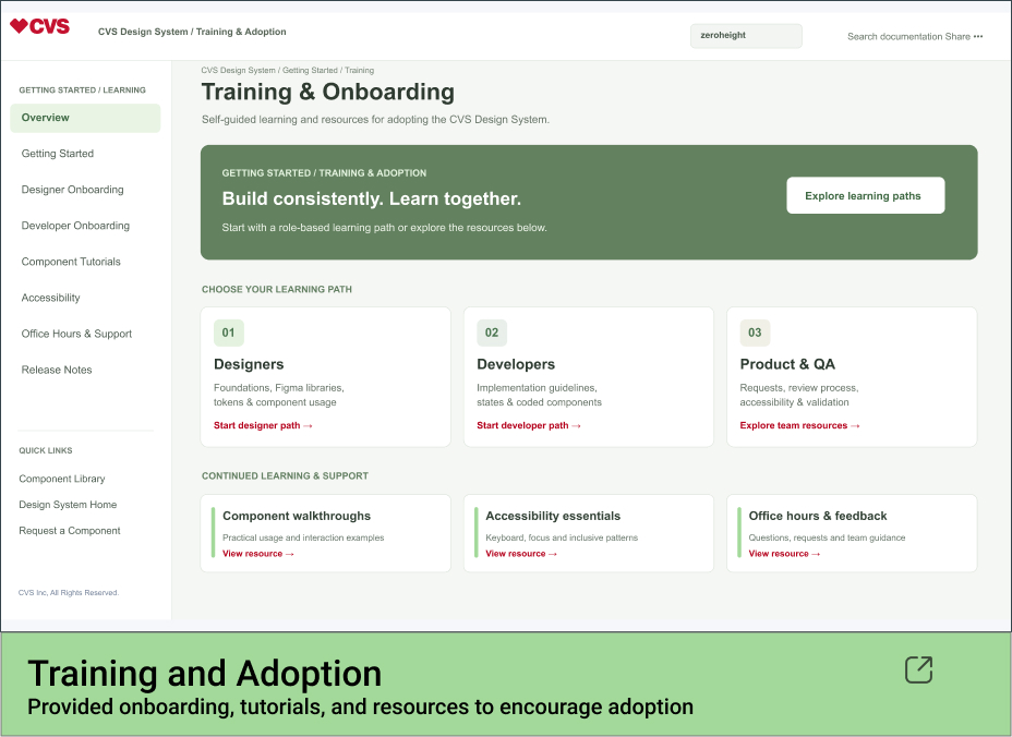
A design system is only as effective as its documentation and adoption. To bridge the gap between design and development, we established a centralized source of truth connecting Figma components, design tokens, and implementation guidelines.
Using Storybook for developer documentation and Zero height for design guidance, we provided teams with the resources needed to implement components consistently, maintain accessibility standards, and support ongoing system evolution.
Key areas included:
- Developer Handoff: Aligned Figma variables, design tokens, component specifications, and interaction states with coded implementations.
- Documentation: Established component usage guidelines, accessibility requirements, and implementation examples.
- Governance: Defined ownership, contribution processes, versioning, and standards for maintaining the system.
- Training & Adoption: Supported teams through onboarding, shared resources, and ongoing guidance.