Overview
ArtCenter was mandated to expand its student reach beyond its physical campus, but wasn’t willing to compromise on the learning experience, its “special sauce,” which included the critiques so essential to student learning. They wanted their online students to participate in the same critique experience as their on-campus students. Most institutions would dropped the idea, resigned that the in-class critiquing process at the heart of art school pedagogy would not be possible in a digital environment. We were convinced that we could deliver an online critique experience that was as dynamic and effective as the in-classroom one. Our vision was compelling enough for the school to commit to going where no art school had gone before and engaged us to bring it to life.
The Challenge
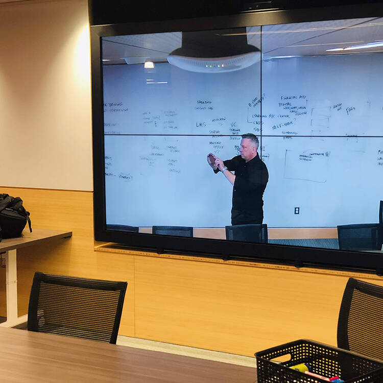
Achieving this ambitious vision had a few challenges that we needed to overcome. The first was to better understand what makes a successful critiquing process. There are numerous types and styles of critiques so we did our due diligence and followed process to help us better understand what would create the best learning outcome. We conducted sessions that included value prop/task flow/scenario exercises, user (student and faculty) and stakeholder interviews, shadowed live classes, etc. All of these efforts informed the learner personas which were used to help guide us in recreating this experience online.
Next, we needed to see how others were approaching the challenge. We spent weeks performing a competitive audit assessing numerous critiquing, annotation and portfolio tools and paradigms, asking: What works well? What doesn’t? What is clunky or missing? Some existing products we liked and felt had interesting parallels included Google Docs, InVision, VoiceThread, Pathbrite, CritiqueIt, Evernote, Khan Academy, Zoom and a few others. While this exercise was valuable, the most sobering takeaway was that all of these fell short of what was needed. By the end of our research, it was obvious that currently available tools fell short of our vision, and no matter how much we tweaked and twisted the code to make them fit, they were never going to deliver the distinctive experience of an in-class critique. We needed to build a customized experience from scratch – we call it the Critique Tool.
Process Snapshot
The process below is very standard for most projects. Depending on the client and project specifics, we may use slightly different labels for specific steps or artifacts. I always reiterate to my team – the importance of educating clients on process adoption, especially if schedule or budget starts to get impacted…When/if that occurs, a less experienced client’s reflex is to compress or eliminate steps which adversely effects quality and expectations.
The Solution
After several months of hard work, I’m thrilled to where we’ve brought the Critique Tool and of all the new ground we’ve broken in achieving our mission. To get a feel for some of the key application features, think about what happens in an art class:
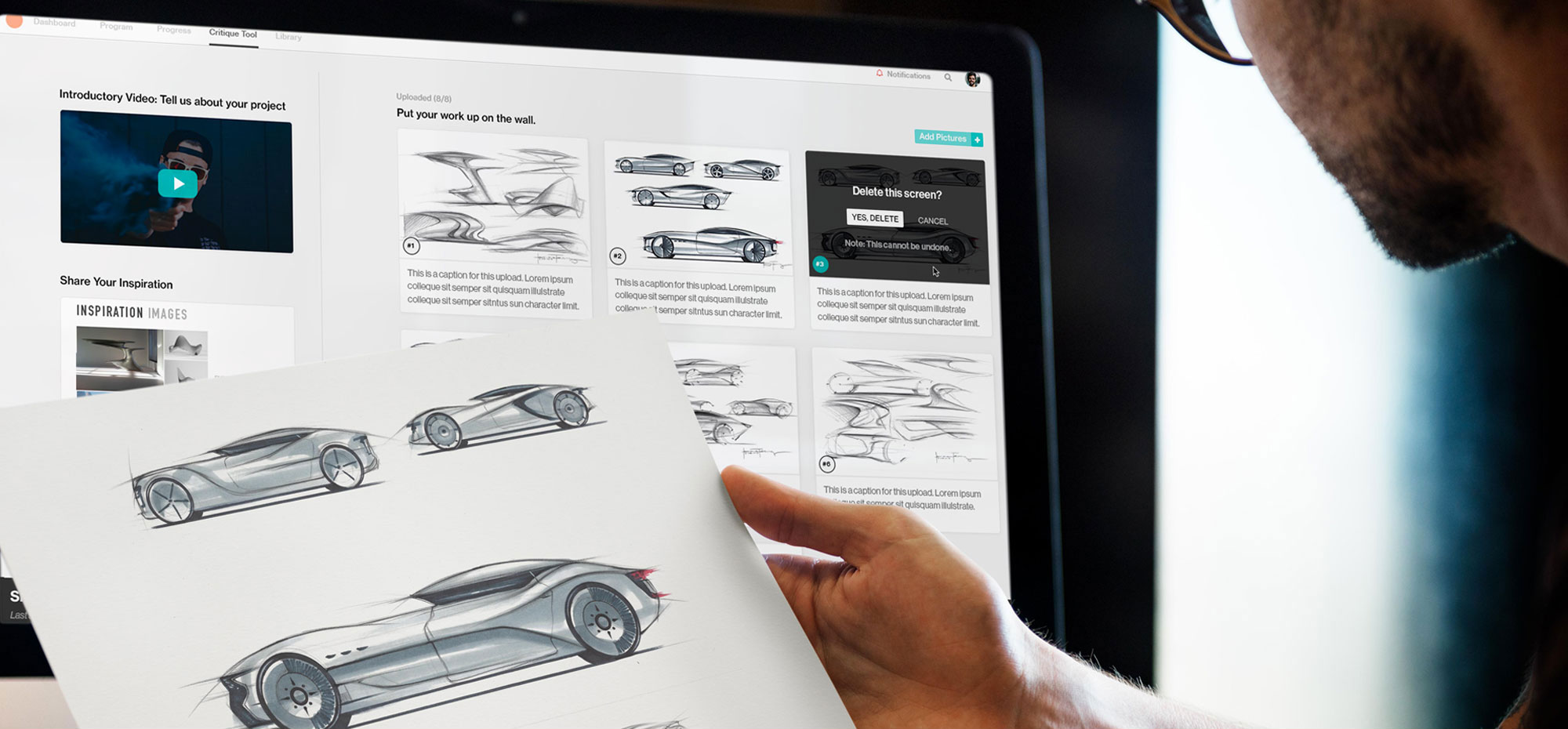
A classroom critique usually begins with a student projecting or pinning their work up for all to see while talking through their approach and inspiration. Likewise, our online critique process begins when the student uploads their work for all to see along along with a recorded video articulating their approach and a moodboard or montage PDF of their inspiration
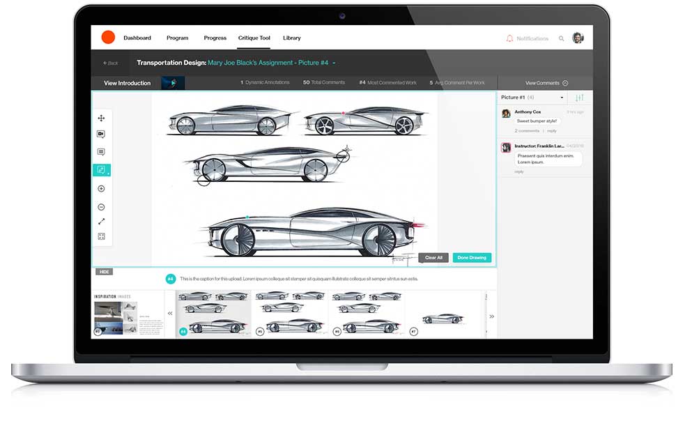
In a classroom, participants might then use a laser pointer, mouse, stickies, gestures or even rearrange the work to point out areas of discussion. The Critique Tool empowers them with digital pins, drawing tools, pointers and annotations that can linked to comments
In short, virtually everything that occurs face-to-face in a brick and mortar art classroom has been replicated in this new online critique tool. To learn more about the Critique Tool, click here to download the blog post.
Responsive
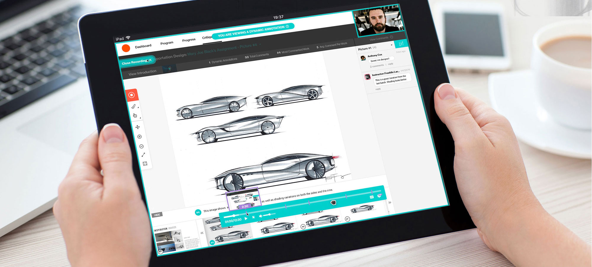
The Critique Tool was designed to work on both desktop and tablet
Robust Annotation Toolset
Choice of laser pointer, markers, pens, colors all make for a powerful toolset
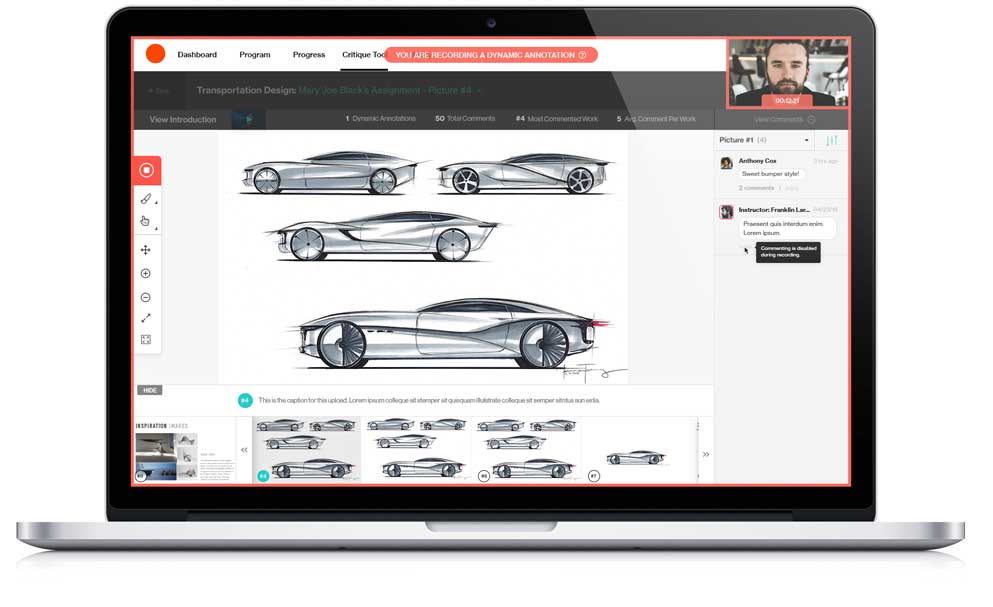
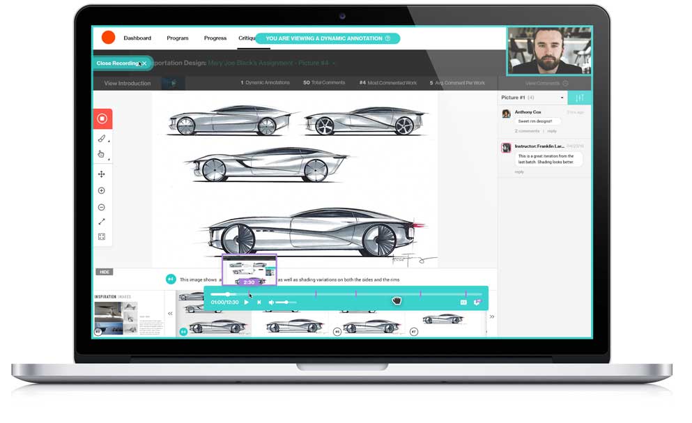
Dynamic Annotation
Users can record a video/audio while marking up with notes or comments
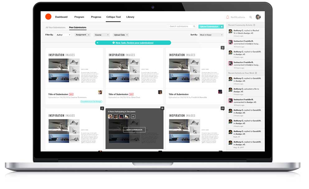
Strong Filtering
The Critique Tool was designed to work on both desktop and tablet
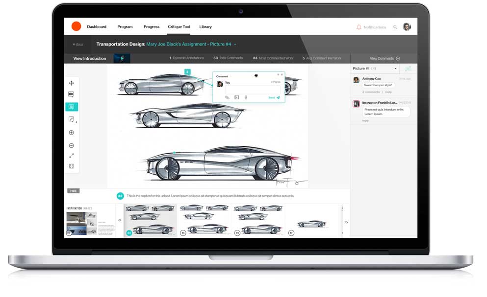
Pinning
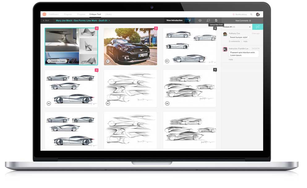
Users can pin a comment or feedback to a specific area of an image
Collapsible Panes
Workspace can be customized by collapsible panes and windows
Commenting..Nested...
Comments and replies are smartly nested and easy to read
Smart Notifications
Notifications are deployed based on to-dos, passed-due and comments
Sample Screenshots
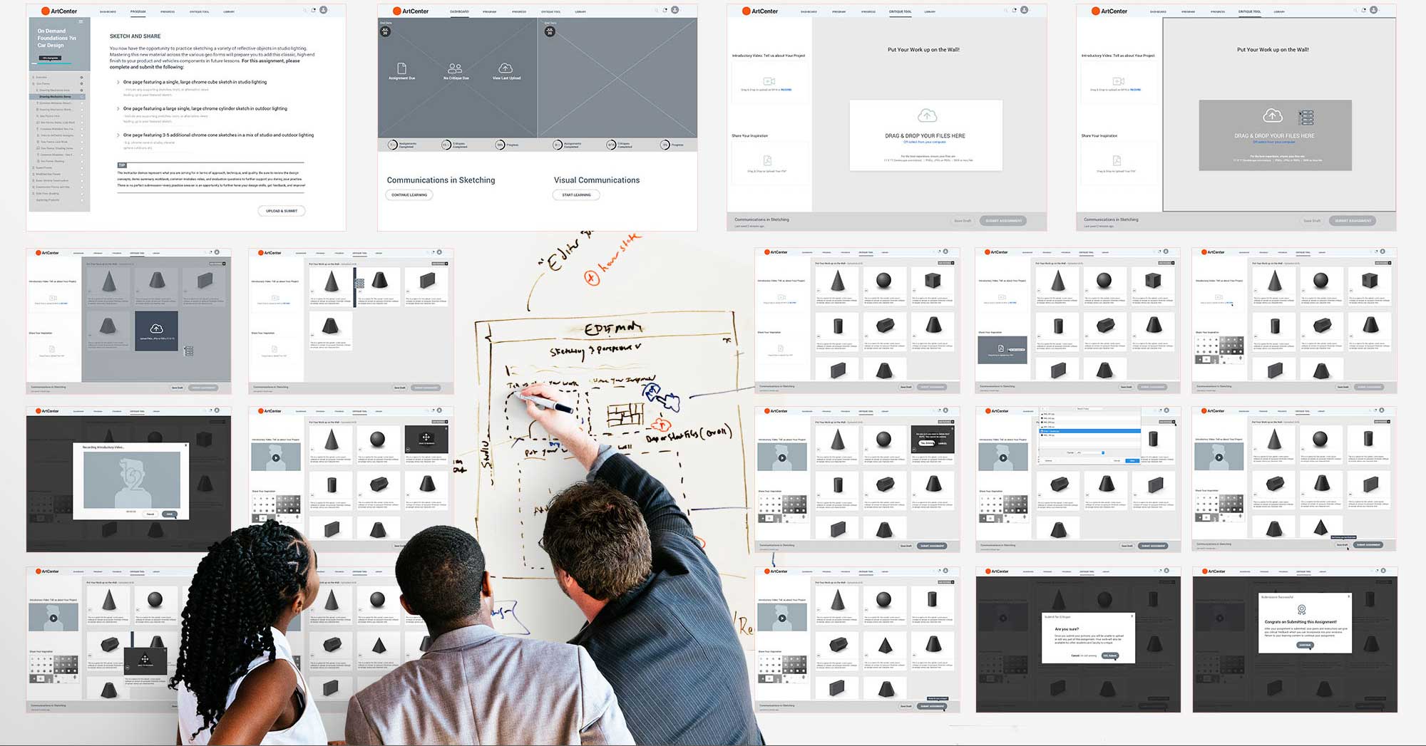
My Role & Artifacts
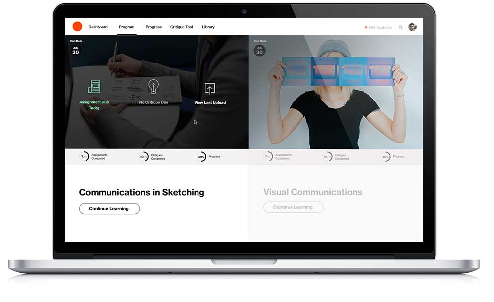
This project was both enormous and enormously exciting. In addition to the Critique Tool, there were several other components that all needed UX/UI including courseware, student dashboard, onboarding learners from prospects to enrolled students, etc. There was also a media component that included several different categories of videos including subject matter experts, how-tos, and mistakes to avoid. Lastly, there was a robust marketing component including marketing strategy/platform, banner ads, landing pages, program pages, brochureware and more. All of these pieces had to look and function seamlessly with each other to present a cohesive experience to all stakeholders and prospects. My job was to help drive the vision and strategy across all components while being a conduit between the various disciplines with regards to process, information and documentation. In addition to my usual director responsibilities, I also had to produce several iterations of wireframes and prototypes due to some resource issues early on.


