Overview
Similar to elite athletes, coaching can also help surgeons improve performance. This could be something simple and qualitative like increasing a surgeons comfort level during a particular procedure. It could also be something more quantitative such as performing a procedure more efficiently measured by less operative time. Short of taking a course or multi-day seminar, there isn’t any type of tool where a less-experienced surgeon could get some quick mentoring from an expert who could share best practices, techniques or advice on a particular procedure. Challenges like this are why Johnson & Johnson chose to engage us to help them create and build their first-ever Surgical Coaching Platform.
Session Onboarding Flow
Session Onboarding Flow
After several stakeholders and user interviews, specific trends and insights started to surface in a way that
we can organize:
Goals, Pain Points & Motivators
GOALS
- Reinforce mentoring culture
- Leverage senior talent
- Improve skill set by procedure
- Create a platform and experience that’s measurable and repeatable
MOTIVATORS
- Make user accountable
- Create an experience that’s easy, valuable and ubiquitous
- Demonstrate value to stakeholders
PAIN POINTS
- Users are extremely busy
- User adoption takes time
- Reluctant to adopt another procedure
BARRIERS
- Process interruptions
- Sufficient number of beta volunteers
- HIPAA compliant
The Challenge
Solving a hard problem with an elegant solution always has challenges and this project was no exception. After several interviews, affinity sessions and some brainstorming, we realized early on that whatever we built needed to address three major pain points – 1. Make it easy for surgeons and coaches to schedule time together. 2. Make it easy to share materials such as documents and images. 3. Make it easy to create, collaborate and track specific goals. From a UX/UI perspective, we realized two important facts – The first is that there wasn’t anything remotely similar to what we were about to create. This made it hard to do any competitive analysis. The second was if we wanted this tool to be successful, we had to address the three earlier pain points head on. In other words, we had to custom build an asynchronous coaching experience that had scheduling, video conferencing, file sharing and one-on-one goal setting and tracking all integrated in one tool.
The Solution
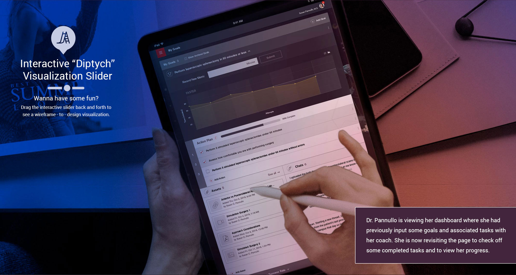
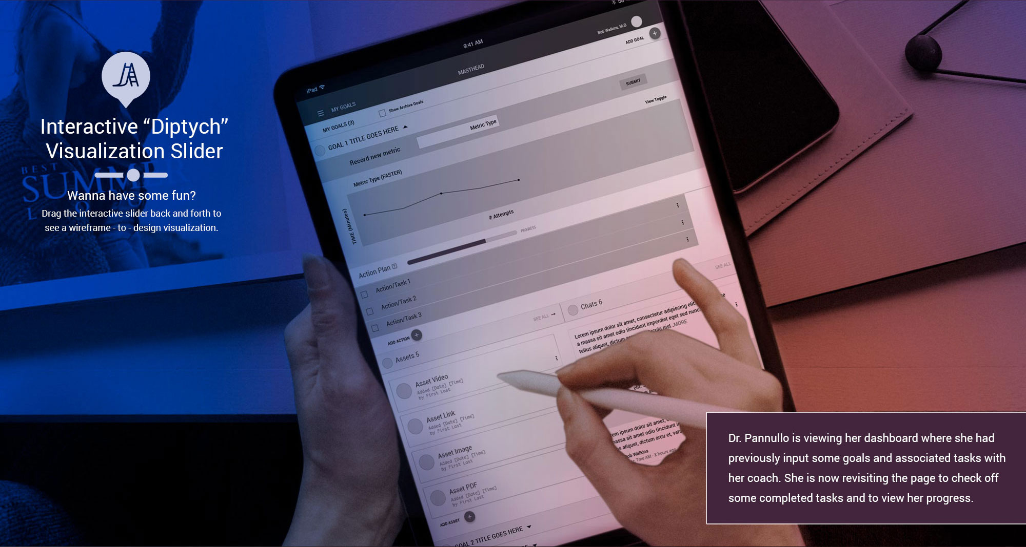
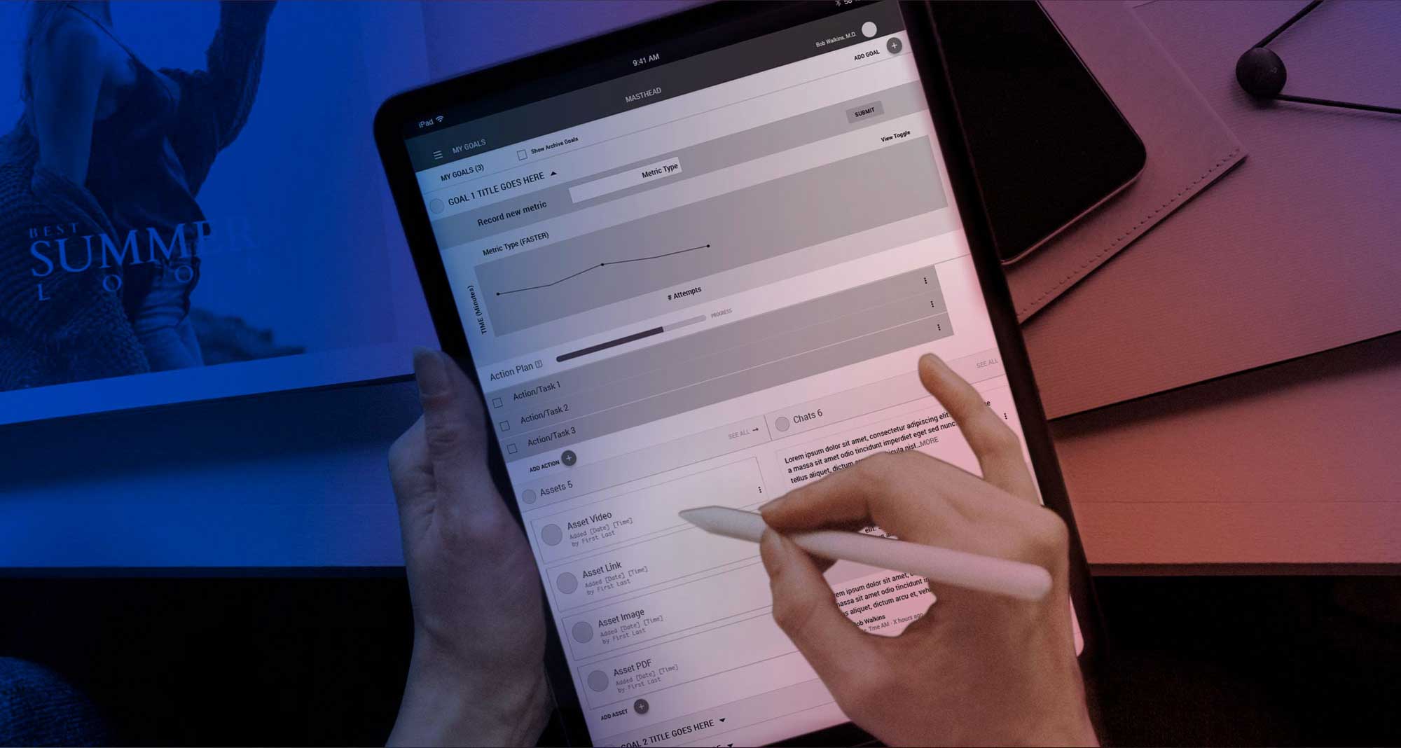
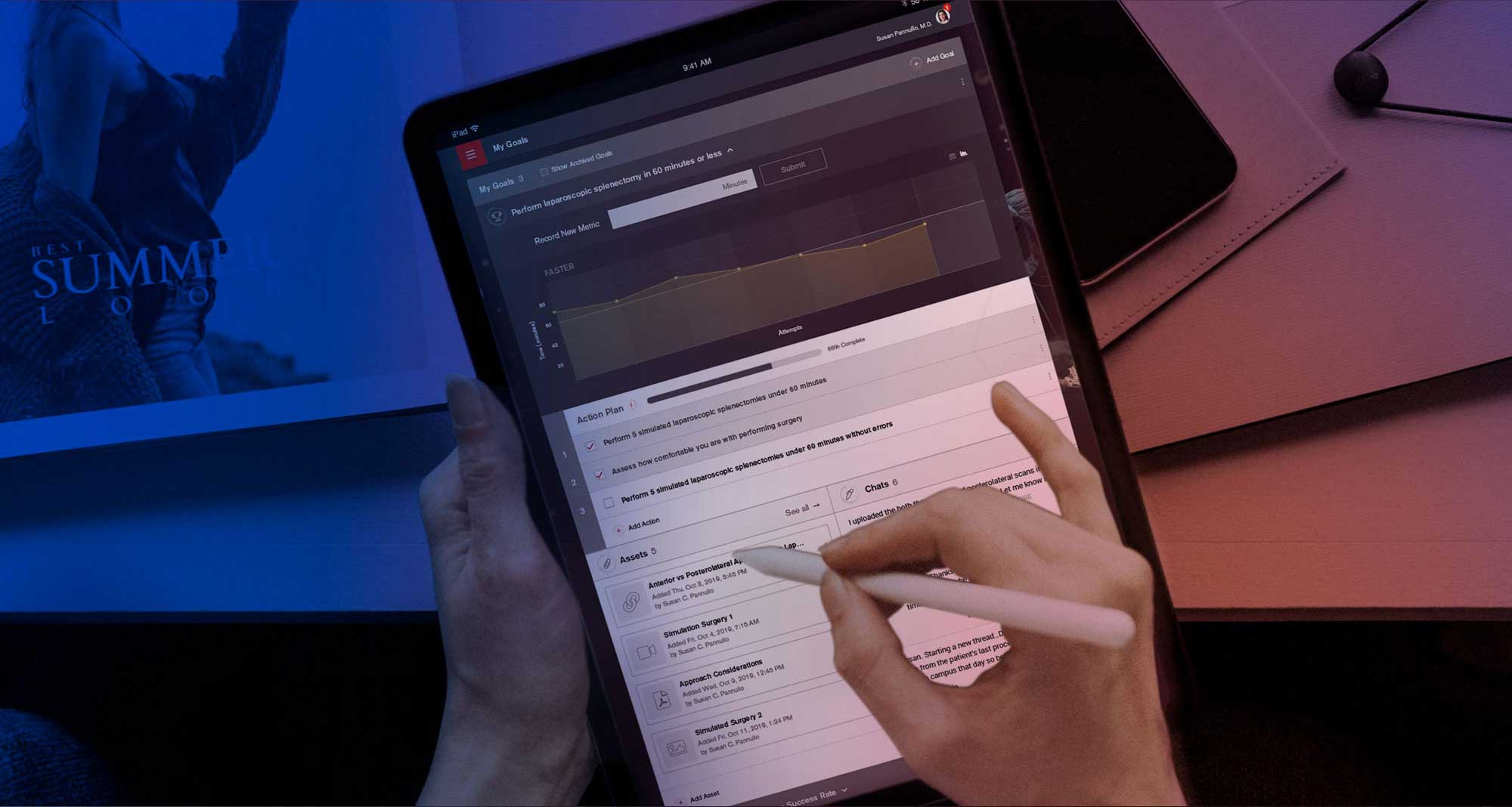
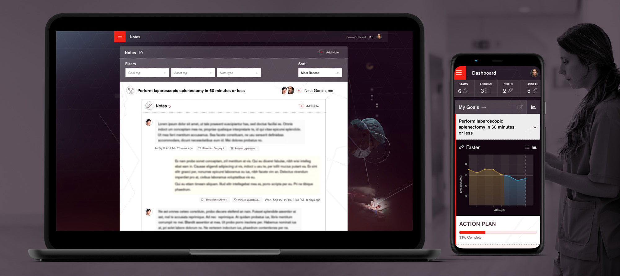
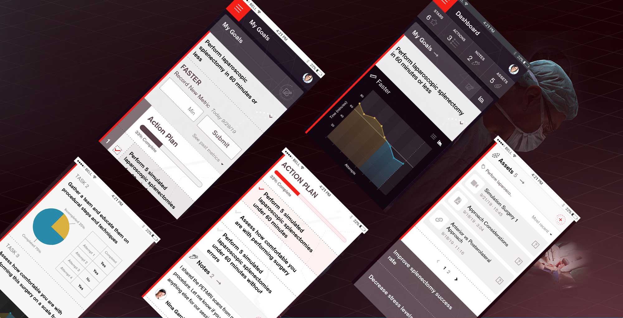
In a short period of time, we had our first of many InVision prototypes that helped us validate assumptions around user/task flow, feature sets and ease of use. Given the conservative audience as well as the J&J umbrella brand, we created a muted color palette, polygonal patterns and a simple UI kit to ensure that the experience of setting and tracking goals was front and center. The guided task experience starts off with a surgeon entering a goal, metrics for tracking the goal and some associated tasks or actions for helping them achieve their goal. They can then supplement with relevant files, documents or notes. Once the setup is completed, the platform will schedule a meeting with their coach to discuss their strategy for satisfying their goal(s). Throughout the experience, there are contextual notifications, rewards and recommendations based on how and what the user is doing.
My Role & Artifacts
In addition to collaboratively driving the creative vision throughout the project, I also ensured that all teams were communicating and working toward the common goal of creating a world-class product that met or exceeded the client’s business objectives and expectations. I also, when needed, personally created a few Sketch prototypes. As with most projects, there are numerous artifacts that helped shape and inform the final product. I’m excited to share a few here. Remember that not all artifacts are beautiful but they all have an important story to tell.
